|
Hi, it is a problem about Compatible Extensions Ajax quick checkout in mobile view
OC2.3.0.2
Pavilion Stylish v2.1.4
Ajax Quick Checkout 6.4
ajax_quickcheckout_pavilion_OC2.zip installed
(I don’t know it is Compatible to the OC & Pavilion version above or not)
——————-
Force bootstrap On
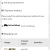
Please have a look on the attachment
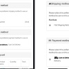
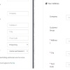
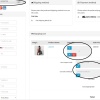
Compare 12345
The left one is the original opencart theme
The right one is Pavilion.
You can see that compare with the original opencart theme, Ajax Quick Checkout cant display well in Pavilion mobile view, the layout become very strange
——————————————–
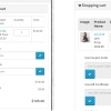
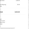
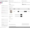
After I add the code in CP from
http://support.themeburn.com/topic/ajax-quick-checkout-and-pavilion-styling
Please have a look on the attachment
pavilionwith code&bootstrap On
123456
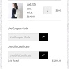
The layout become better. But I think it is also a little bit strange. For example, the Input field is too short compare with the original theme ‘s Input field.
And the coupon code Input field is also not so normal…
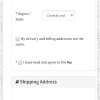
Force bootstrap Off
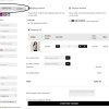
With the code in CP from
http://support.themeburn.com/topic/ajax-quick-checkout-and-pavilion-styling
Please have a look on the attachment
pavilionwith code&bootstrap Off
12345
Actually, it become very strange again, all the column move to the left side of the screen, and also the guest/register/login logo‘s word crooked….
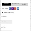
In the Desktop View:
——————————————-
Force bootstrap On
add the code
all column move to the left side of the screen.
———————————–
Force bootstrap Off
add the code
the layout become messy.
Force bootstrap Off
no code
Prefect!!!
I have worked for this about a week, when the desktop view is ok, the mobile view suck….
I don’t know how to set them precisely….
Please let me know if there is anything that can be done., Sorry for my poor English!
-
This reply was modified 2668 days ago by
 Ken Yeung. Ken Yeung.
-
This reply was modified 2668 days ago by Ken Yeung.
|
|
|
I aslo send you the latest version of Ajax quick checkout,thanks
-
This reply was modified 2668 days ago by Ken Yeung.
|
|
|
Force bootstrap On
NO CODE in CP
Compare 12345
The left one is the original opencart theme
The right one is Pavilion.
|
|
|
After I add the code in CP from
http://support.themeburn.com/topic/ajax-quick-checkout-and-pavilion-styling
pavilionwith code&bootstrap On
123456
|
|
|
Force bootstrap Off
With the code in CP from
http://support.themeburn.com/topic/ajax-quick-checkout-and-pavilion-styling
pavilionwith code&bootstrap Off
12345
|
|
|
In the Desktop View:
——————————————-
Force bootstrap On
add the code
all column move to the left side of the screen.
———————————–
Force bootstrap Off
add the code
the layout become messy.
—————————
Force bootstrap Off
no code
Prefect!!!
|
|
|
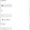
Hi,
Can you try to disable the “Force Bootstrap” option and add this extra CSS for mobile devices (small screens):
@media (max-width: 768px) {
  .row > div:not([class*="col-xs"]) {
    width: auto;
    max-width: calc(100% - 30px);
  }
  #d_quickcheckout .qc-quantity {
    width: auto !important;
  }
  #d_quickcheckout .qc-quantity input {
    width: 40px !important;
    max-width: 40px !important;
  }
  #d_quickcheckout .qc-quantity .input-group-btn {
    display: none !important;
  }
  #d_quickcheckout .qc-checkout-product table thead td
  {
    padding-left:  10px;
    padding-right: 10px;
    font-size: 12px;
  }
  #d_quickcheckout .qc-checkout-product table tbody td:first-child,
  #d_quickcheckout .qc-checkout-product table tbody td:last-child
  {
    padding-left:  0;
    padding-right: 0;
  }
}
@media (max-width: 480px) {
  #d_quickcheckout .form-group > [class*="col"] {
    max-width: 100% !important;
    margin-top: 10px;
  }
  #d_quickcheckout .qc-checkout-product table {
    display: block;
    overflow-x: auto;
    border-left: none;
    border-right: none;
  }
}
BR,
ThemeBurn team
|
|
|
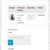
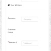
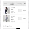
Don\’t know why suddenly can\’t upload IMG in this post…
After add the CSS,the problem 99% resolved
But still have a small problem in the product table
Can u also have a look?
Thank you very much
U help a lot
|
|
|
Hi,
Product table is scrollable. We’ve minimized spacing inside table, but it still cannot fit in small screens, even if you decrease the size of the product thumb.
BR,
ThemeBurn team
|
|
|
thanks, i will try to ask the designer of the ajax seem can fix the Product table or not
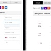
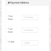
also, i find that the login popup of ajax with pavilion have a small problem too.
the red circle mark a unnecessary “<" next to the password form
how can i remove the "<" in here?
|
|
|
also in the ajax checkout desktop view, the page with english show well, but in chinese, those small icon next to some text have a wrong position
|
|
|
#d_quickcheckout i.fa,#d_quickcheckout i[class*="fa-"] {
vertical-align: top !important;
}
#d_quickcheckout .preloader {
margin: 0px!important;
}
I added the code above to the css in the AQC, the wrong position of the small icon resolved.
but the login popup of ajax with pavilion’s unnecessary “>” next to the password form
still exist.
|
|
|
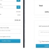
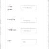
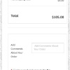
after using the code u provide so as to enlarge the content in mobile view
@media (max-width: 768px) {
#wrapper {
margin: 0 !important;
padding: 30px 20px 20px 20px;
}
}
the form in acq become not fit to the mobile view again
how can the form show in attachment extend to the marked yellow part ?
including the form “POST OFFICE”
thanks you very much
|
|
|
Hi,
Here is some CSS to fix the “>” problem:
#login_form #remeber_password {
  display: block;
  margin: 10px 0;
}
BR,
ThemeBurn team
|
|
 ubadaalamer on
 edugarsb on
 gazza1970 on
 kks787 on
 mtaitimu on
 suhrig on
 izmailskiy on
 magicbit on
 logdoc on