|
Hello,
The site does not display correctly on mobile ipad horizontal view. I get large spaces to the right of full width content and my header stacks columns. I don’t want screen size above 1023 to stack columns. I just want it to display as seen on desktop.
How do i turn off the responsive for above 1023px and how do I target this size?
Please advise,
Debra
|
|
|
Hi Debra,
Can you please provide screenshots (and some screenshot legend) that illustrate the problematic spacing?
By default grid columns are stacked under 768px, but you can explicitly control each column’s width.
http://i.imgur.com/T0otvyE.png
BR,
ThemeBurn team
|
|
|
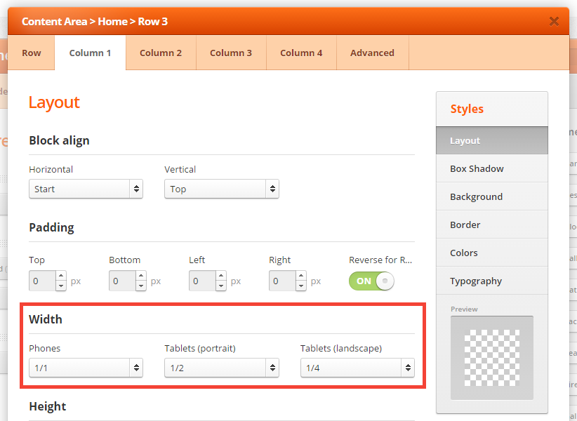
Okay, i found my problem. I changed the columns in the shoppica control panel. But found that you also have to edit the row and then further define the columns for “width” settings specifically for phones, tablets (landscape) etc. This is a very odd interface that I am not used to and it seems you need to edit in multiple places.
|
|
|
Hi,
Generally, by default when you insert a new Page Builder row and create columns, they should stack only for smallest screens. Tablet (portrait and landscape) should keep original column sizing.
BR,
ThemeBurn team
|
|
 ubadaalamer on
 edugarsb on
 gazza1970 on
 kks787 on
 mtaitimu on
 suhrig on
 izmailskiy on
 magicbit on
 logdoc on